Why care about Digital Signs?

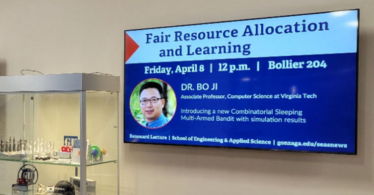
A small part of my work at Gonzaga involves managing content on three smart screens installed in a large atrium hallway. Hundreds of students, staff and faculty walk by at least one of these screens every day, and prospective students and their families stop nearby on frequent tours. This is an ideal place to put photographs of the engineering and computer science work being done, as well as announcements and positioning statements.

When they heard I had changed up what I was doing with our smart screens, other campus departments began to submit their messages.  Most were things that would be helpful — career service offerings, job fairs, mental health support, stress relief, messages surrounding our Jesuit value of Cura Personalis (care of the whole person). The problem: most of the slide submissions were designed like presentation slides. But these were in a hall with a lot of foot traffic. These didn’t have a captive audience reading every word. The lettering was tiny or in a fancy font that wasn’t instantly legible. Instead of absorbing the message with a glance, students took a glance and quickly looked away.

I *want* to include those messages! I know that a message has to be shown to the average person multiple times  in order for it to stick. I want to support the people who are doing difficult jobs at the university. I want to support the students ‘cuz I remember what it was like to be one.

Bottom line, I know there’s a better way. By rethinking the “slides” on digital signage as “billboards,” and applying those best practices, I truly believe our campus can improve messaging efforts.


Don’ts of Digital Signs

The following designs are samples from Canva’s templates. These aren’t bad designs, but they just don’t work for Digital Signage – where you have 3 seconds to communicate your message.

  • Don’t have more than one message at a time. Got more messages? Make more slides!
  • Don’t make your text too small. Test out your design by walking away from your computer screen and looking at a distance. Don’t stare at it, glance at your message to see if it’s legible.

example
  • Don’t use white or bright backgrounds. It’s like shining a flashlight in your viewers’ eyes!
  • Don’t make your viewer guess where to look. Direct the eye with clear hierarchy and color choices.
  • Don’t overuse all-caps. Words that are all the same height take longer to read and understand.
  • Don’t put dark color text on a saturated/middle color background. Advocates for the visually impaired have programs to help designers pick colors with enough contrast to be seen.

  • Don’t use more than one image. If you have multiple images, make multiple slides!
  • Don’t squeeze letters together. Make sure there’s enough ‘white space’ around each character so it can be quickly and easily read.
  • Don’t spread a phrase back and forth across a slide. A viewer should be able to take it all in at once.

One Type to Rule Them All

Your message probably has text. But what is that text going to look like?

example

The easy answer for digital signs: big letters, made up of thicker lines, without froofy-fancy ornaments, and with plenty of ‘white space’ between the letters.

Please please please please please stick to one font.* Really.  You have maybe 3 seconds to get your message across. You want your viewer to understand it immediately.

*Only read this if you need to be precise and annoyingly correct. Technically, each of those styles is a unique font within a typeface. Unless you want to make typefaces a serious part of your career, just call ’em “fonts.”

example

I know, that hand-lettered look is soooo cute and trendy… But isn’t your message more important? 3 seconds!

For example, (left) is that a capital F or a stylized T? A passer-by won’t take the time to think.

Another current trend uses small type on a big field of color. Please don’t do this to your elders. Big clear type gets the message seen and understood.

About Type

Every design program uses “Type” to lump together all the aspects of what your letters look like. These are the settings you can usually control:

Font – one specific set of letter styles. These styles can include Bold, Italic, and Bold Italic.
Calibri and Cambria are the standards in modern PC-based Microsoft Office products. (I haven’t used Mac for 30 years, so I can’t tell you what Apple’s go-to fonts are.)

Font Size – The size of the letters, measured in “points” – a system leftover from early printing press days.

Alignment – left, right, or center. Most English text lines up on the left, and many headlines align in the middle.

Spacing – either the horizontal space between letters (tracking) or the vertical space between lines of text (leading). You DO want enough space between characters and words so they are easily understood. You DON’T want too much space so they look strange or floating away.

Dos of Digital Signs

Bright digital displays light up several city centers, such as New York’s famed Times Square. Messages compete with each other with alluring faces, surprising text, or simple bombardment of lights.

This is the kind of advertising landscape the urban world is used to. Universities can take a page from the modern marketing playbook to convey messages about student affairs and campus life.

Think Billboards

Our audience is on the move. The typical exposure time is short – less than five seconds. When a digital sign shifts from one message to another, it tends to catch a passer-by’s eye. But even then, that person is not likely to slow down to look at a message, so a digital message needs to be concise, clear, and clean.  

  • Concise: the fewer words, the better. Industry standard is SEVEN. Practice with the Six-Word Memoir concept.
  • Clear: Composition, typography, and color let the viewer absorb the message immediately.
  • Clean: Only a few design elements. No clutter!
One image, one headline, one message.