Challenge: Refine the Program Guide color glossy trifold, adding polish and clarity to the condensed information.
When I returned to Spokane Public Radio after a several-year hiatus, the Program Guide evolved from a newsprint magazine to a glossy trifold. Budget constraints demanded the physical tri-folds print with black and a blue accent color.
I made two versions of each issue – one prepared in C and K for print and properly packaged through InDesign, a second version optimized for digital.
Specific improvements included:
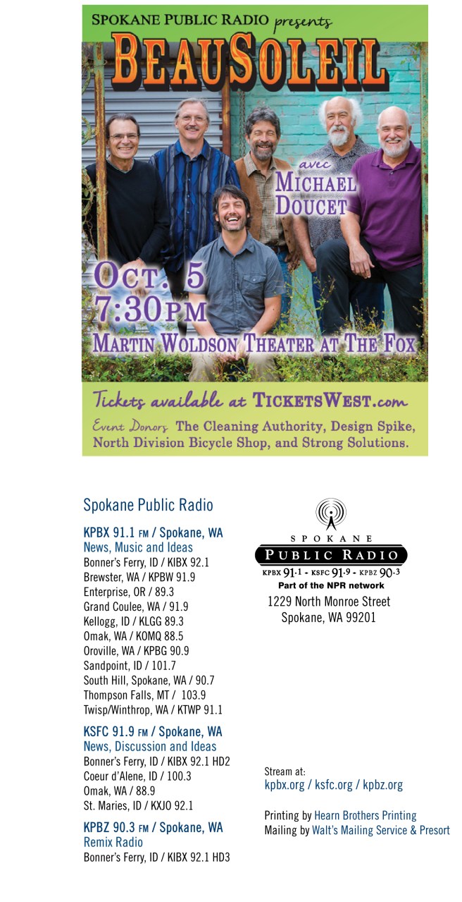
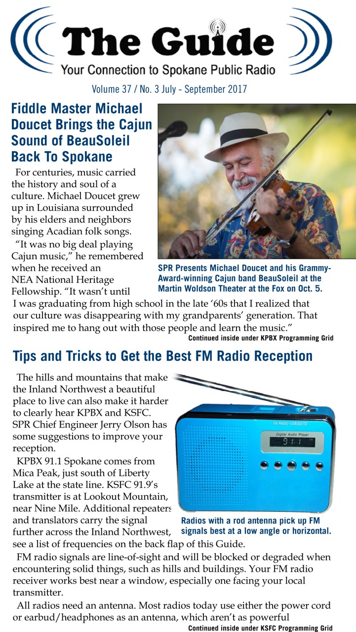
- One story on the front panel, at maximum two, with strong visual interest. Stories could continue on the inner panels.
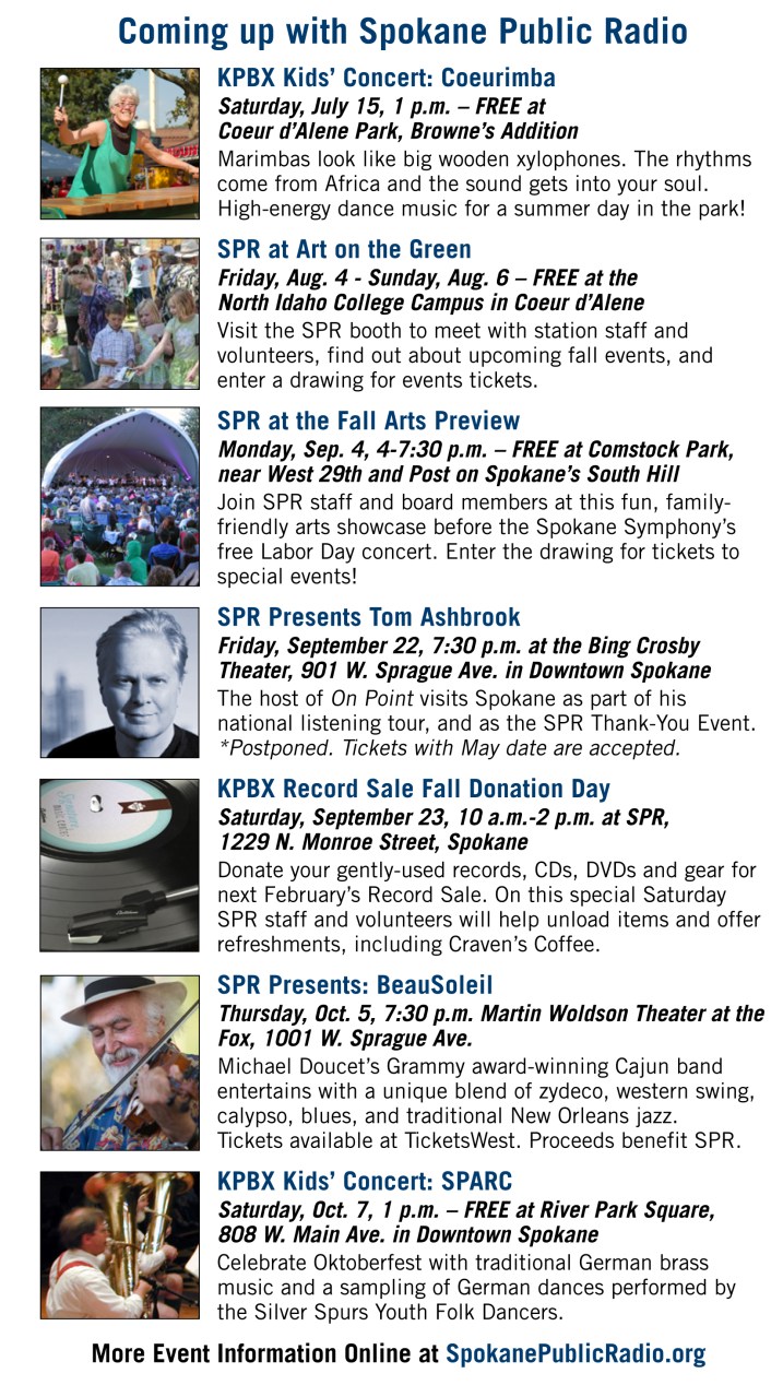
- A clear event guide. If a description needed to stretch an extra line, so did the image – ensuring a strong visual cue for each specific event listing.
The event guide could be reprinted larger and displayed at each station event, removing past events and adding however many upcoming events would fit.
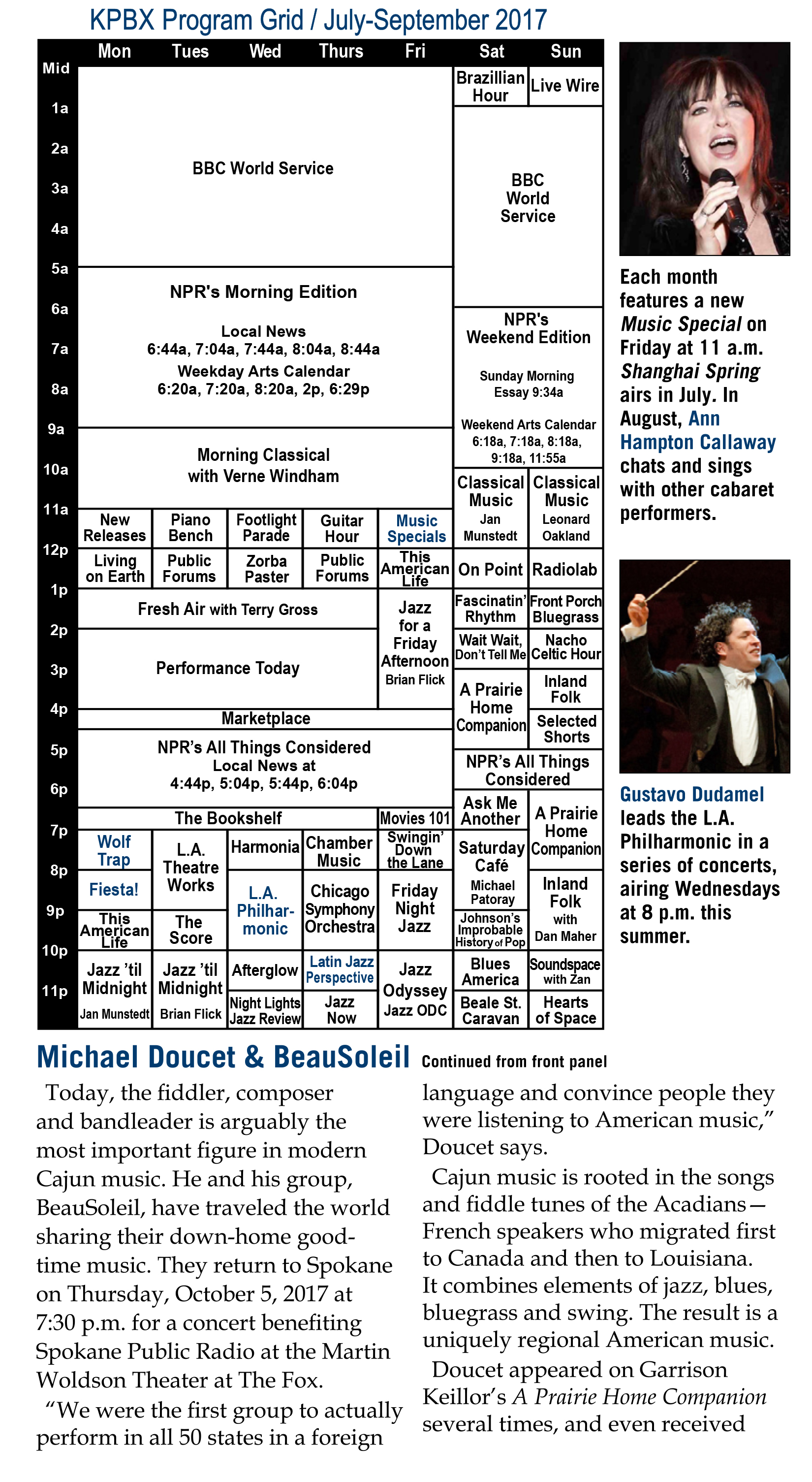
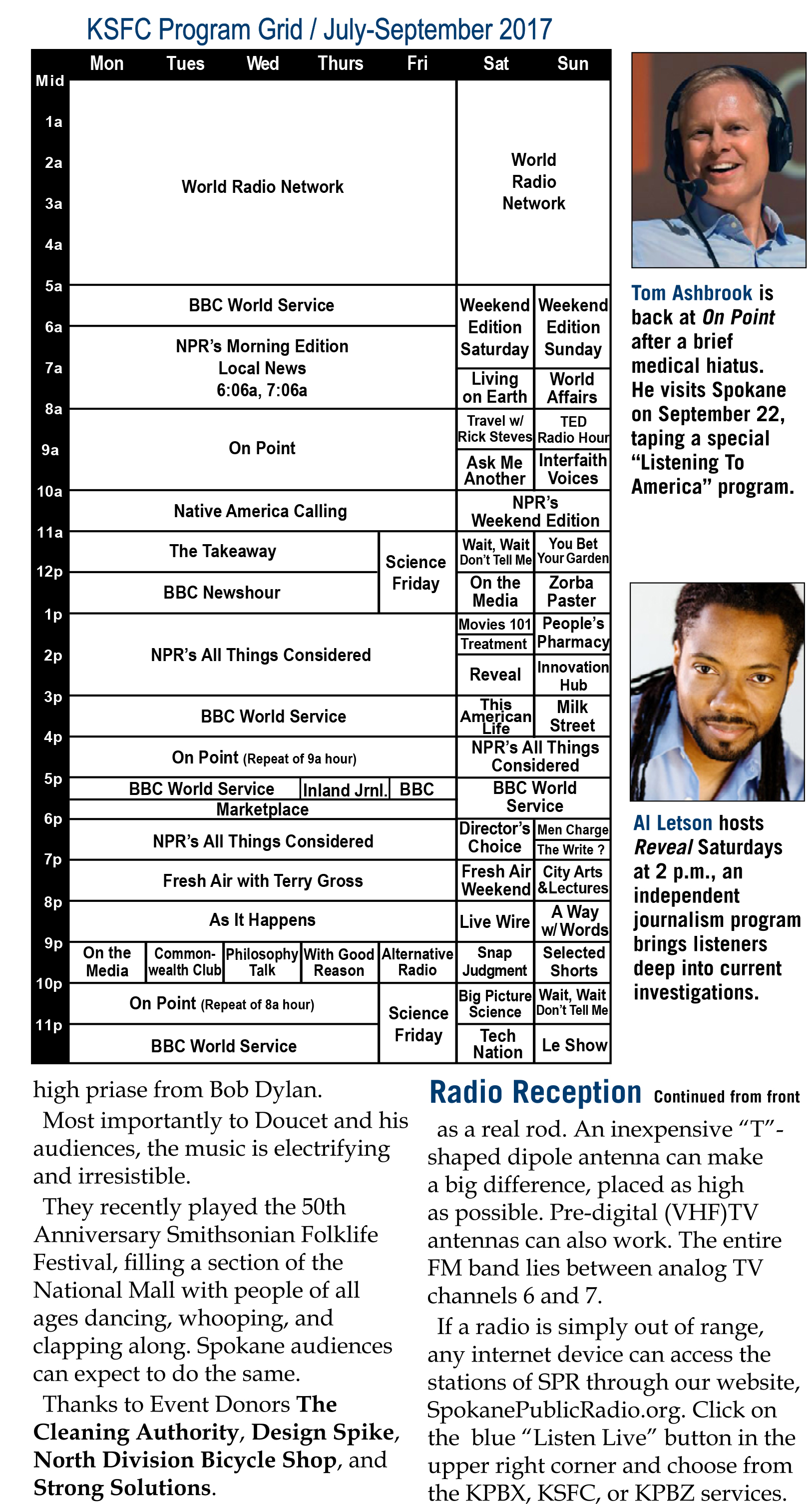
- Schedules for each service stream needed font consistency and a standard size. To aid the programming staff, the Grid could be printed onto a single legal-size paper. Working backwards, the grid refined to fit only two sizes of the chosen font.
- To showcase changes from the past quarter, the titles of new shows turned blue.
- To continue highlighting ‘the people of public radio’ – either hosts or special guests – the side of each grid featured two thumbnail images with context underneath.
Public radio depends on members and donations, and the audience still appreciated physical donation forms. The form location was on the back of the bulk addressing area, just in case a form was not filled out legibly.
USPS required the addressing panel to display horizontally, allowing space for an advertisement on the far left. For the web version, the advertisement showed right-side up with full station identification underneath.
Past Guides are online at the SpokanePublicRadio.org site.