
Challenges: Design a single flyer promoting two separate concerts in a quarterly series.
- Clarity: Viewer had to easily distinguish between the two events, yet it needed visual unity.
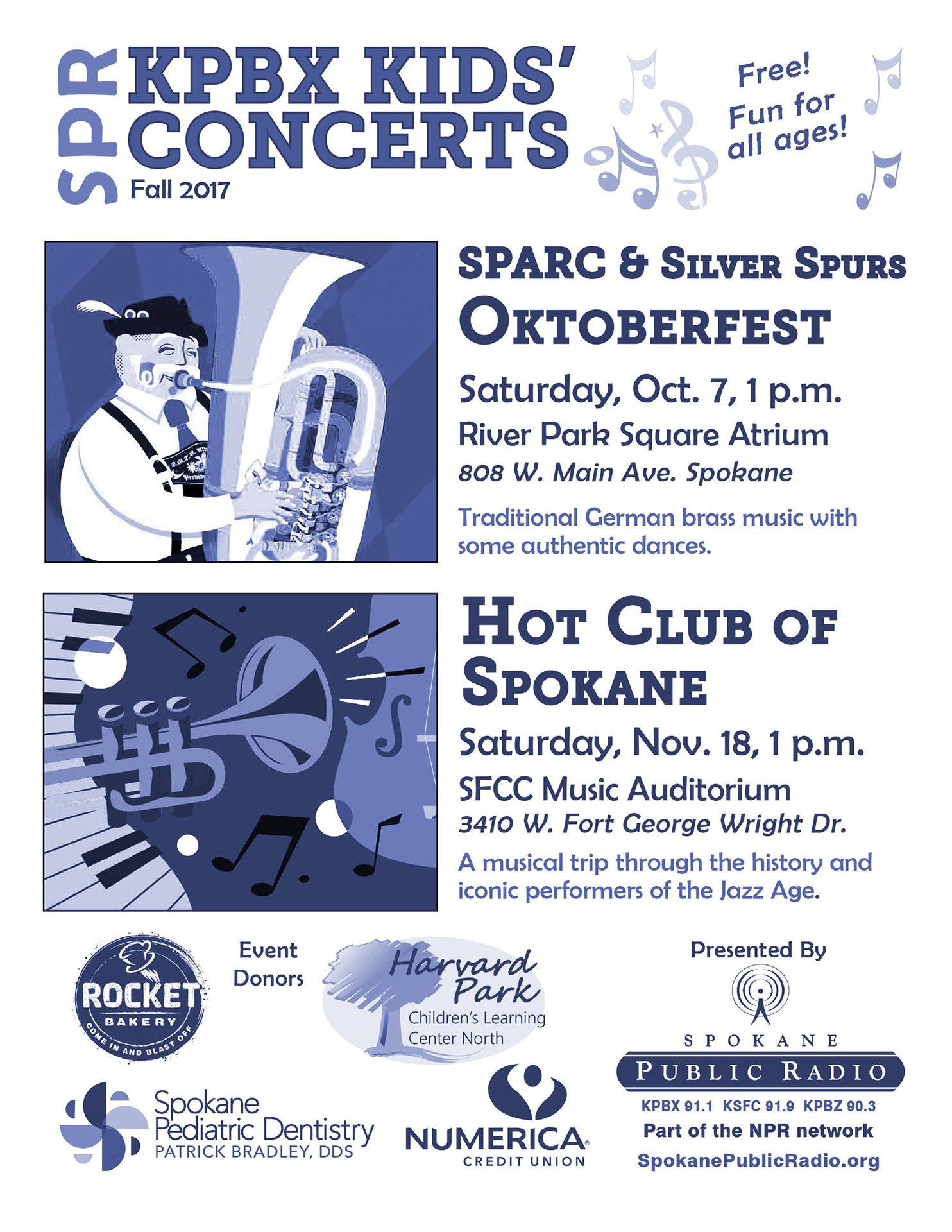
- Color flexibility: The cost of 1,000 flyers to distribute throughout the region demanded single-color offset printing. Digital/web use plus small-scale laser prints demanded a vibrant look.
- Logo Balance: The layout had to display the presenter’s logo and up to four additional sponsor logos, noticeable but not overwhelming.
- Consistency: Brand recognition required a similar visual theme throughout the series. The heading and lower-right SPR logo needed to stay consistent.
Move the slider to see color for digital use, spot color offset for bulk print.
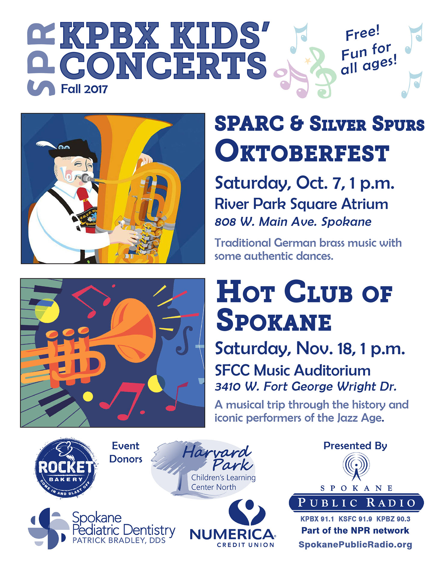
I developed a modular flyer design with a consistent header with a date, ensuring easy updates and visual continuity. The layout featured:
- Dual concert sections with distinct but complementary designs, using two fonts: a bold header font for clarity and a quirky, kid-friendly font for personality.
- Side-by-side text and imagery, with each concert’s details (headline, time, date, location, and short description) paired with a square image — either a flat-vector illustration or artist photo.
- Color-to-grayscale conversion for print: I carefully adjusted contrast and tone to ensure the flyer remained legible and visually appealing in one-color offset printing.
On this particular flyer, I edited the flat-vector colors to have the same vibrant palette.
