
Challenge: Create a school orientation T-shirt design that students might want to wear again.
After a lifetime of seeing circular wordmarks in block letters – reinforced by the “Collegiate” font – I set out to create a design that for one of the several schools at Gonzaga University. The full school name wraps around the top of the ring, with its more common acronym proudly dominant in the center. The university name is couched at the lower end.

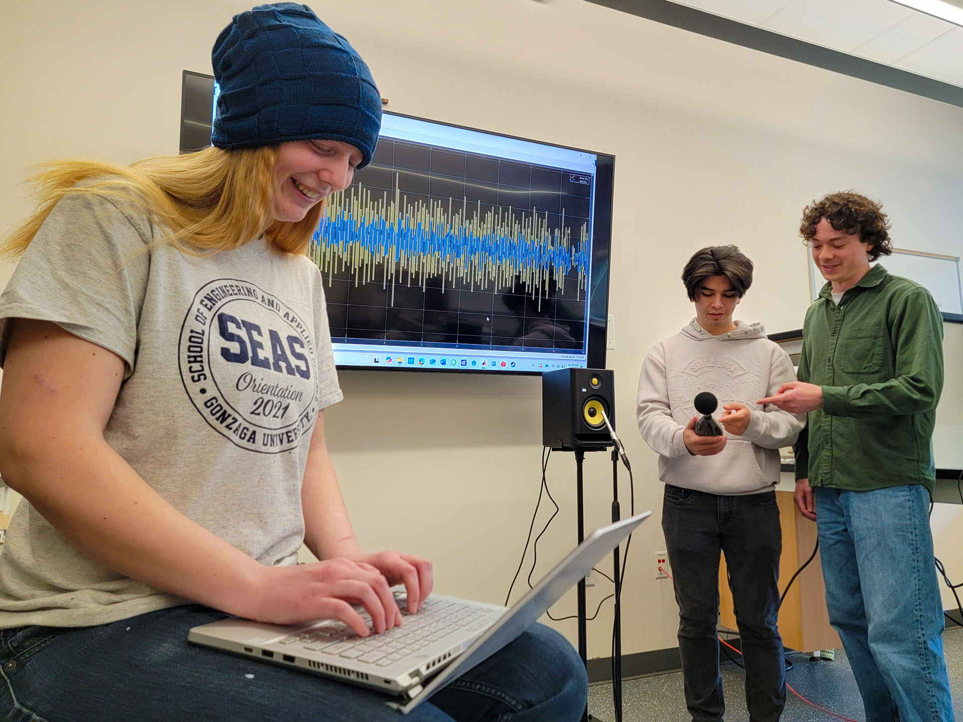
While administrators chose to put “Orientation” on the shirt, the students preferred a design that included the school’s establishment year. The wordmark became a popular sticker, especially when the outside ring became solid Gonzaga blue with white lettering. It adorns water bottles and laptops throughout the student and alumni population. It’s also *the* souvenir for engineering or computer science prospective student visits.
The only official logo for the academic work of any school is the “Spires” vector image. This fun image was grandfathered into the university Brand refresh to represent student life inside the School of Engineering and Applied Science.
The annual Senior Design awards laser engraved an adapted design onto plexiglass inserted into an LED base.
