A blog post on early childhood readers called for an illustration of children’s blocks spelling out “hyperlexia.” First stop, give Adobe image generation a go.
Instead of “Children’s letter blocks spell out H Y P E R L E X I A” it returned children with blocks spelling “Hyprlxic” “Hyprexiic” and “Hyprlzic.”
And there’s a funky reason why…
We know about the large language models (LLMs) that train text generation AI. At Gonzaga University, projects with LLMs include training them to recognize emotion via word usage.
I thought image models acted similarly, associating a text prompt with visual patterns. The descriptions of the source images are crucial. Turns out that the image generator isn’t getting a big-picture plan. It’s pulling together patterns that it’s been fed and building an image by individual pixels. Are you old enough to have played with early computer Paint software? This is the same pixel-by-pixel drawing on steroids.
So even though I spelled out the word, it had no human to correct the text during the generation process. It knows the general patterns of those letters, but can’t map out what each letter actually looks like. To be honest, I’m glad AI can’t truly replace human creativity… although I know it’s coming, for better or worse.
No AI was harmed in the creation of this text.
“Hyperlexic” created by JJS Images from an Adobe Stock image of every letter block. Yes the edges are funky, imagine they were thrown in the air ;)
I love my workplace—and like any large organization, it has its challenges. An institution generally needs many colleagues with a similar purpose, but in other areas only needs the expertise of one or two specialists.
In my case, I support academics (my alma mater!) with communications: translating the work of one school to the rest of the institution, prospective students, and other stakeholders.
The challenge? Some schools only have one full-time communications specialist. That can feel like being a zebra among horses.
Dazzling zebras (by Nadine Haase, licensed via Adobe)
Some of us joke about being unicorns, but honestly, there are enough of us to form a herd—so I say we’re zebras. And what is the collective noun for zebras? A *dazzle*!
Lately, all of the academic marketing specialists have started meeting monthly. We’ve always shared ideas and advice informally, but this scheduled time together feeds my spirit. We speak the same language. We understand the same pressures. And we leave with tools, templates, and confidence to bring back to our own departments.
When our dazzle disbands, we return to our horse herds stronger and better equipped.
Would I love to connect every day? Absolutely. But even once a month reminds me I’m not alone.
And that’s the point: find your dazzle. Whether it’s a formal group or a few trusted peers, community matters. It makes the work lighter, the ideas brighter, and the challenges easier to tackle.
I’m grateful for my dazzle. And I’m also grateful that it’s not a pack of jackasses.
If you’re ever invited to a long Friendsgiving weekend two states away, you might not want to invade your hosts’ kitchen for two days making batches of German Christmas bread.
However, since it was our only chance to be with our college-grad-working-in-the-real-world daughter before Christmas, that meant this Friendsgiving trip is the only chance to carry on our family tradition together.
We’re thankful that our hosts surrendered their kitchen. And they’re grateful for the gift of almond paste, rum-soaked raisins, and love.
The baker at work
The entire process screams Project Management. She didn’t study business but this is a truly fun way to understand the basics.
Clarifying the Scope
We probably need 30-ish loaves to get us through the gift-giving season, and that’s just not possible within the time frame. One batch makes four loaves, and one oven can handle two batches a day. So a realistic goal is 12-16 loaves before hopping on a plane.
Time Management
Over the years, she’s figured out the project’s dependencies. There are two long dough rests between kneading – first two hours, then four hours. The raisins and cherries need to soak overnight at minimum (any leftovers? They can stay in the rum and keep soaking). Bake time about an hour per two loaves. Working backward from those dependencies is her timeline.
And she uses the downtime well, to prep the next step, record her vlog intros or transitions, spend time with the loved ones, and to rest up.
Stakeholder engagement
Recipients have different needs – some need less salt, some are away from home and need the bread frozen to receive later or sent to another address. These are all stakeholder needs to be considered.
Many of those logistic questions can be handled by her assistants – Dad and Mom. We are her assistants, her budget officers, her procurement team. That means a lot of strategy and communication when setting up for a project two states away.
Our hosts? Crucial resources. They surrendered their kitchen for two days and helped with logistics: rides to stores, appliance guidance, and where everything lives.
Tangible Resources
Ingredients, appliances, accessories—essential tools we all coordinated. We did have one communication snafu: she thought we’d bring almond paste from Spokane, Dad assumed it was available in Arizona. Oops. Google to the rescue: homemade almond paste. Manageable, less expensive, and looks the way it’s supposed to. The real question: will it taste the same?
That’s Quality Management. Standardization matters. Different ovens, different ingredients—those variables could affect quality. She certainly knows what each product milestone needs to look like so we’re thinking positive.
Delicious deliverables
What started as a family tradition turned into a mini case study in project management: scope, time, resources, stakeholders, quality. I think she nailed it. She’s working in a retail bakery now, and these types of life experiences are moving her forward.
Thank you for your patience as my site catches up. I began this portfolio & blog nine years ago and a lot has changed, both in WordPress and in my own career.
I’ve liked showing the fun, creative side of me. I highlighted my creative bursts, the lessons learned from quirky projects. But I should add examples of my daily professional work — B2B communications, project aids, and formatted web content designed to make others shine.
I would rather do the work than talk about it.
Website wireframe
I’d be exhausted if all my work consisted of creative bursts. I like the collaboration of making someone else look good. I like formatting what someone else wrote, finding the rhythm in their words, and making it shine. I like working within a brand’s parameters — tailoring the design and language to bring out the best in someone else’s story.
That’s why, as of November 2025, this site is a work in progress as I pull together a representative sample of the value I bring to organizations I believe in. Thanks for joining me on the journey.
Birthday Rose at the 9/11 Memorial – JJS photo 2023
Most people remember September 11, 2001 through the constant barrage of television images, but for me and my colleagues at public radio, it was a day where gears shifted from ‘business as usual’ to the epitome of ‘essential service’ in a heartbeat.
It was the day I learned exactly what my professional adrenaline looks like.
Our radio clock was set to turn on at 7 a.m. PT. We expected to hear the standard top-of-the-hour newscast, but instead, we heard host Bob Edwards’ voice falter.
He said the unthinkable: he could not fully describe what he was seeing, but one of the Twin Towers in New York City had just collapsed.
Our sleepy heads jerked awake. We stared at each other for a moment, then rushed to the living room TV. The screen didn’t show New York, though; it showed smoke rising from a low, dense building I quickly recognized as the Pentagon. The Pentagon, too?
I jumped into some clothes and hopped in the car, stopping just long enough to pick up a dozen donuts—a small treat for a staff facing what promised to be a grueling day. I arrived at the station just after 7:30 a.m. to the news that the second tower had fallen.
The world was desperate for information. In times of crisis, National Public Radio is a global anchor—trusted for clear-headed, centrist reporting. But that morning, the sheer volume of global traffic did the impossible: NPR’s digital system crashed.
That system fed dozens and dozens of web-based news modules that put national news automatically on local station websites. A year earlier, I had worked as an NPR temporary project specialist, helping stations across the country integrate those same modules.
That project meant I had an NPR email, and it was still active. While the public-facing servers were buckling under the weight of a watching world, I could log into internal communications for real-time updates. I began manually typing the updates into the KPBX website.
Another plane crash in Pennsylvania, likely related. The FAA orders all flights grounded. Suspected hijackers identified.
For hours, I was the manual link between the national feed and our visual internet audience—people at work who didn’t have a TV or a radio but they had internet and felt transfixed by this tragically historic day.
Around 11 a.m., our program director cut away from the news speculation to regularly scheduled classical music—a necessary, somber grace note for a nation in mourning. I didn’t find the time to cry until later that day, sitting in the middle of a Mass at Gonzaga’s St. Aloysius Church.
By the time NPR’s external systems were back online, the narrative had shifted from the “what” to the “who.” I was able to pivot again, this time promoting stories of the Airway Heights community coming together to comfort stranded passengers.
Looking back, that day was a masterclass in why communications professionals do what we do. When the systems fail and the adrenaline kicks in, the job isn’t about the tools or technology—it’s about the people needing a sense of clarity. It’s about doing everything possible to provide that ‘essential service.’
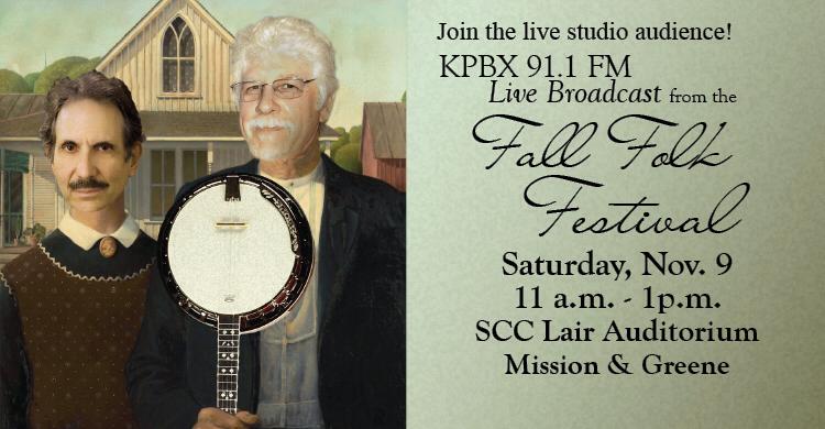
If you know about the Fall Folk Festival (and you really should get to know the Fall Folk Fest!) you know that KPBX, the main station of Spokane Public Radio, holds a live broadcast sampler of the music performers. When I worked there, we looked for creative ways to promote the broadcasts… and got a really crazy idea. How about putting the faces of then-hosts Carlos Alden and Verne Windham onto the artwork of American Gothic? And instead of a pitchfork, holding an instrument? Like Carlos’s favorite, the banjo?
Challenge accepted.
This was a LONG time ago (20 years?!) and Photoshop’s made face swaps *really* easy now. If I was doing this today, I could make a “content aware fill’ to remove the heads of the brother and sister in the original painting. I’d be able to shade the sides of Carlos and Verne’s heads from their photographs so they match the painting better.
But eh, that’s a perfectionist’s perspective.
Almost every year, as the FFF draws near, this image makes the social media rounds again. Kudos to Carlos and Verne’s wacky sense of humor. Cheers to everyone who gets a smile out of it. And thank you to the original photographer of Verne’s pic — Don Hamilton perhaps?
My father-in-law was a hobby photographer. He loved the technical details of determining aperture, shutter speed and ISO, tracking each shot’s specifications for future reference. He took deep vistas of natural wonders and close-up studies of people, especially his wife and children.
More importantly, he inspired others to be photographers. His younger brothers loved photography as much as he did and tried to out-shoot each other. His wife took up the challenge of matching his skills and continued that calling long after he he had gotten bored with point-and-shoot technology. His older son borrowed the camera frequently until he received his own. As a result, hundreds of images in digital, slides, negatives and prints existed to help tell his life story.
My father-in-law, two years after coming to the United States, graduating from Stanford University. Photo taken by one of his younger brothers. Slide scanned and color corrected by JJS
It’s because of those *other* photographers that we have a clear record of him. He didn’t bother with self-portraits. Through his life, those who *loved* him caught him again and again doing the things he loved.
His intense stare as he studied a plant or a rock.
His loving smile with a cat who decided this man meant ‘home.’
His proud toiling in his yard, either weeding, watering, raking, planting, picking fruit, or splitting wood.
His analyzing of jigsaw pieces for a puzzle.
His mischievous twinkle as he blocked someone else in a tabletop game.
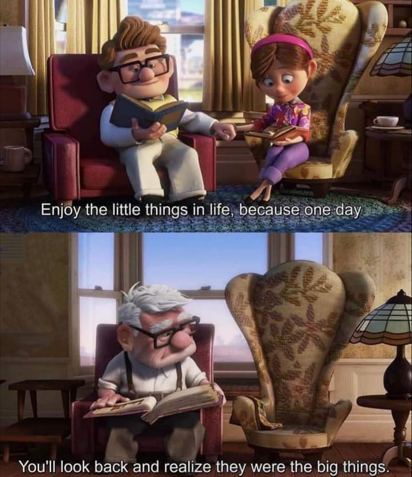
Photos are unique. That particular moment of time will never come again. Capture or it is lost. In my experience, lost moments are also easily forgotten.
And to be honest, it was difficult to catch a really good photo of him. So many times he had a quizzical look because he didn’t think this moment was important enough for a photo, or he’d have a big smile at the start of a group photo then fade during subsequent takes because one shot should be enough and why are we still standing around here… or he’d just keep talking so his face fell into odd contortions. So perhaps a reason why his wife and I each took bunches of pictures of him later in life was the challenge of catching a good one.
When the family realized the patriarch was terminally ill, we dealt with the news in different ways. I coped by jumping into my digital image collection and searching through all pictures of him. Finding and collecting those solid reminders of past memories sustained me through the inevitable decline. Next I turned to my mother-in-law’s camera phone, where she had followed him through his mundane habits. A morning of dividing day-lilies, a lunch with his signature whole-grain bread, an afternoon puzzling through bills. Candid images to avoid his dismissive ‘what are you doing’ frown.
I can’t thank her enough for those pictures.
The highlights went into a slideshow of my father-in-law’s life which looped silently through the reception after his memorial service. Almost 250 photos told his very interesting life story. The photos in exotic locales were impressive, but the photos in familiar places doing familiar tasks were endearing.
Why shouldn’t we celebrate the tiny moments? And when those moments are gone, let’s enjoy the memories of what was. Not to dwell too much on them or futilely wish we could go back, but to smile at the memories and make connections to today.
Here’s to the photographers, the chroniclers, the memory-keepers. Capture the little things so we may hold them dear.
A professional photographer I know said he heard this question a lot: “What’s the *best* camera to have?”
His answer? “The best camera is the one you have at the moment.”
In other words, capturing the moment with any camera is better than not capturing the moment at all.
I get a little comfort out of that these days, when the camera I can use is my cell phone camera. Granted, it’s a darn good camera, I just wish I could control the depth of field to focus tightly on what the story is about.
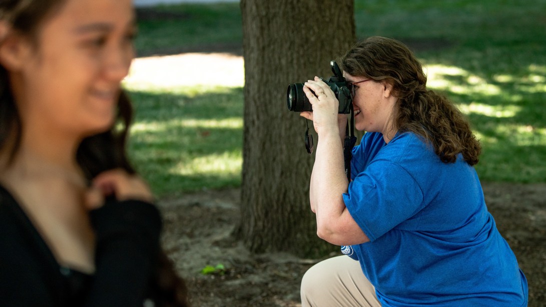
Gonzaga’s staff photographer, Zack Berlat, caught a great pic of me in 2018 capturing SEAS students at our first Welcome Walk. I’m using our family’s SLR digital camera, and only having a little issues with the viewfinder.
Since then, my nearsightedness has gotten worse. I can still frame a photo well; I just can’t isolate the subject. People and things in the background are just as sharp as the subject, so the picture is ‘cluttered.’
I remember someone else saying photography is about the ideas and the passion you bring to it. So those ideas and passions are going into something I still do really well — photo editing in Photoshop. I use several masked layers and filters to highlight the story of a photo, playing with the lighting and saturation to make the event as vibrant as I remember.
I’m still taking candid photos at work, such as students at work or the SEAS Orientation picnic. They’re just not the professional portrait shots I used to take.
Change comes hard. Thank you, technology, for still making photography an option.


