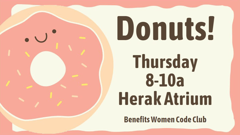
Your message probably has text. But what is that text going to look like?

The easy answer for digital signs: big letters, made up of thicker lines, without froofy-fancy ornaments, and with plenty of ‘white space’ between the letters.
Please please please please please stick to one font.* Really. You have maybe 3 seconds to get your message across. You want your viewer to understand it immediately.
*Only read this if you need to be precise and annoyingly correct. Technically, each of those styles is a unique font within a typeface. Unless you want to make typefaces a serious part of your career, just call ’em “fonts.”

I know, that hand-lettered look is soooo cute and trendy… But isn’t your message more important? 3 seconds!
For example, (left) is that a capital F or a stylized T? A passer-by won’t take the time to think.
Another current trend uses small type on a big field of color. Please don’t do this to your elders. Big clear type gets the message seen and understood.
About Type
Every design program uses “Type” to lump together all the aspects of what your letters look like. These are the settings you can usually control:
Font – one specific set of letter styles. These styles can include Bold, Italic, and Bold Italic.
Calibri and Cambria are the standards in modern PC-based Microsoft Office products. (I haven’t used Mac for 30 years, so I can’t tell you what Apple’s go-to fonts are.)
Font Size – The size of the letters, measured in “points” – a system leftover from early printing press days.
Alignment – left, right, or center. Most English text lines up on the left, and many headlines align in the middle.
Spacing – either the horizontal space between letters (tracking) or the vertical space between lines of text (leading). You DO want enough space between characters and words so they are easily understood. You DON’T want too much space so they look strange or floating away.
