
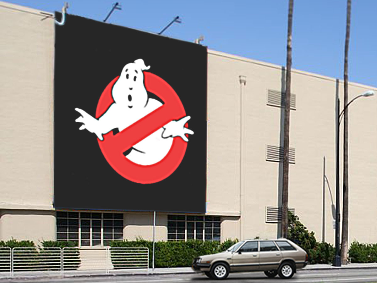
Come on a little memory journey with me. It’s early spring 1984. I live in Burbank, California – home to several studios, including a big independent lot called the Burbank Studios. Every day, on the way to and from school, we drive by the outer wall of the studio lot covered in towering movie poster billboards – two stories high.
One day, they start painting this weird one with a blobby white ghost thing. And then there’s the international NO symbol on it – red circle with a line through it. ‘No ghosts’ maybe. No text either. Just a big black sign with the ‘no ghost’ thing.
Then more signs with the same image start popping up everywhere – bus stop ad signs, roadside billboards – all spring there’s this ‘no ghost’ thing. We thought it might be related to Casper the Friendly Ghost, because it looked a little like the way Casper’s non-friendly relations were drawn.
Four things that made it work:
- It was really cute.
- It was a simple design.
- We could talk about it with a descriptive name – no ghosts.
- It was EVERYWHERE.
And – most importantly – it was a good product. A lot of times, the hype leads to a letdown after a big reveal. This film was worth the buildup, a real summer blockbuster.
My point is that you can introduce a product or a campaign without a call to action. Sometimes the art speaks volumes without explicitly saying a thing.
Just make sure that the payoff is worth the tease.
